PLoS ONE

- Altmetric
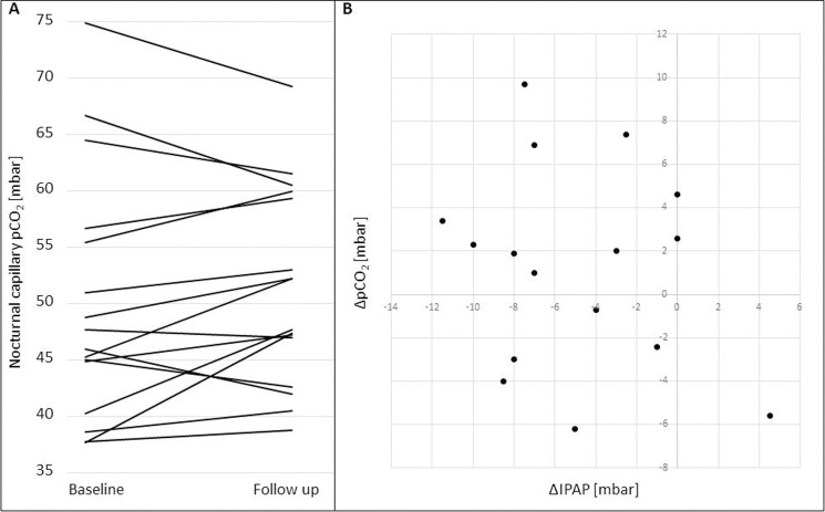
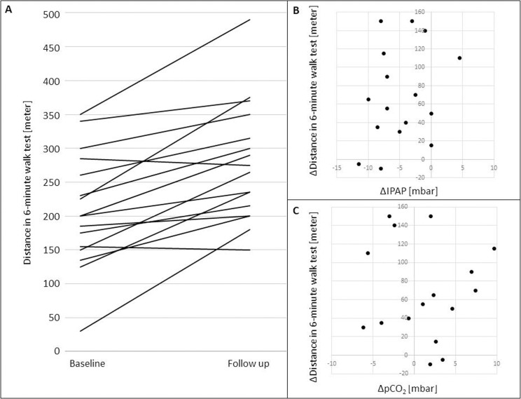
In Fig 4, panel B does not appear. In Fig 5, panels B and C do not appear. Please see the correct Figs 4 and 5 here.


pCO2 values at baseline and follow-up and correlation of ΔpCO2 with ΔIPAP.
A. Each line represents an early morning pCO2 value for a single patient at baseline and follow up. B. Scatter plot illustrating the correlation of ΔpCO2 (pCO2 at follow-up—pCO2 at baseline) and ΔIPAP (IPAP at follow-up—IPAP at baseline).


6MWT distances at baseline and follow-up and correlations of Δ6MWT with ΔIPAP and ΔpCO2.
A. Walking distances in the 6MWT at baseline and at follow-up. Each line represents a patient. B. Scatter plot illustrating the correlation of Δ6MWT (6MWT at follow-up– 6MWT at baseline) and ΔIPAP (IPAP at follow-up—IPAP at baseline). C. Scatter plot illustrating the correlation of Δ6MWT (6MWT at follow.up– 6MWT at baseline) and ΔpCO2 (pCO2 at follow-up—pCO2 at baseline).
Reference
1
 Correction: Non-invasive ventilation with pursed lips breathing mode for patients with COPD and hypercapnic respiratory failure: A retrospective analysis