 Evaluating epidemic forecasts in an interval format
PLoS Computational Biology


The authors have declared that no competing interests exist.

- Altmetric
For practical reasons, many forecasts of case, hospitalization, and death counts in the context of the current Coronavirus Disease 2019 (COVID-19) pandemic are issued in the form of central predictive intervals at various levels. This is also the case for the forecasts collected in the COVID-19 Forecast Hub (https://covid19forecasthub.org/). Forecast evaluation metrics like the logarithmic score, which has been applied in several infectious disease forecasting challenges, are then not available as they require full predictive distributions. This article provides an overview of how established methods for the evaluation of quantile and interval forecasts can be applied to epidemic forecasts in this format. Specifically, we discuss the computation and interpretation of the weighted interval score, which is a proper score that approximates the continuous ranked probability score. It can be interpreted as a generalization of the absolute error to probabilistic forecasts and allows for a decomposition into a measure of sharpness and penalties for over- and underprediction.
During the COVID-19 pandemic, model-based probabilistic forecasts of case, hospitalization, and death numbers can help to improve situational awareness and guide public health interventions. The COVID-19 Forecast Hub (https://covid19forecasthub.org/) collects such forecasts from numerous national and international groups. Systematic and statistically sound evaluation of forecasts is an important prerequisite to revise and improve models and to combine different forecasts into ensemble predictions. We provide an intuitive introduction to scoring methods, which are suitable for the interval/quantile-based format used in the Forecast Hub, and compare them to other commonly used performance measures.
1. Introduction
There is a growing consensus in infectious disease epidemiology that epidemic forecasts should be probabilistic in nature, i.e., should not only state one predicted outcome but also quantify their own uncertainty. This is reflected in recent forecasting challenges like the United States Centers for Disease Control and Prevention FluSight Challenge [1] and the Dengue Forecasting Project [2], which required participants to submit forecast distributions for binned disease incidence measures. Storing forecasts in this way enables the evaluation of standard scoring rules like the logarithmic score [3], which has been used in both of the aforementioned challenges. This approach, however, requires that a simple yet meaningful binning system can be defined and is followed by all forecasters. In acute outbreak situations like the current Coronavirus Disease 2019 (COVID-19) outbreak, where the range of observed outcomes varies considerably across space and time and forecasts are generated under time pressure, it may not be practically feasible to define a reasonable binning scheme.
An alternative is to store forecasts in the form of predictive quantiles or intervals. This is the approach used in the COVID-19 Forecast Hub [4,5]. The Forecast Hub serves to aggregate COVID-19 death and hospitalization forecasts in the US (both national and state levels) and is the data source for the CDC COVID-19 forecasting web page [6]. Contributing teams are asked to report the predictive median and central prediction intervals with nominal levels 10%, 20%,…,90%, 95%, 98%, meaning that the (0.01, 0.025, 0.05, 0.10, …, 0.95, 0.975, 0.99) quantiles of predictive distributions have to be made available. Using such a format, predictive distributions can be stored in reasonable detail independently of the expected range of outcomes. However, suitably adapted scoring methods are required, e.g., the logarithmic score cannot be evaluated based on quantiles alone. This note provides an introduction to established quantile and interval-based scoring methods [3] with a focus on their application to epidemiological forecasts.
2. Forecast evaluation using proper scoring rules
2.1. Common scores to evaluate full predictive distributions
Proper scoring rules [3] are today the standard tools to evaluate probabilistic forecasts. Propriety is a desirable property of a score as it encourages honest forecasting, meaning that forecasters have no incentive to report forecasts differing from their true belief about the future. We start by providing a brief overview of scores which can be applied when the full predictive distribution is available.
A widely used proper score is the logarithmic score. In the case of a discrete set of possible outcomes {1,…,M} (as is the case for counts or binned measures of disease activity), it is defined as [3]
Until the 2018/2019 edition, a variation of the logarithmic score called the multibin logarithmic score was used in the FluSight Challenge. For discrete and ordered outcomes, it is defined as [8]
An alternative score which is considered more robust than the logarithmic score [12] is the continuous ranked probability score
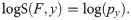
To facilitate an intuitive understanding of the different scores, Fig 1 graphically illustrates the definitions of the logarithmic score (left) and CRPS (middle). For the CRPS note that if an observation falls far into the tails of the predictive distribution, 1 of the 2 blue areas representing the CRPS will essentially disappear, while the size of the other depends approximately linearly on the observed value y (with a slope of 1). This illustrates the close link between the CRPS and the absolute error.

Visualization of the logS, CRPS, and IS.
Left: The logarithmic score only depends on the predictive probability assigned to the observed event y (of which one takes the logarithm). Middle: The CRPS can be interpreted as a measure of the distance between the predictive cumulative distribution function and a vertical line at the observed value. Right: The interval score ISα is a piecewise linear function which is constant inside the respective prediction interval and has slope ±2/α outside of it.
2.2. Scores for forecasts provided in an interval format
Both the logS and the CRPS cannot be evaluated directly if forecasts are provided in an interval format. If many intervals are provided, approximations may be feasible to some degree, but problems arise if observations fall in the tails of predictive distributions (see Discussion section). It is therefore advisable to apply scoring rules designed specifically for forecasts in a quantile/interval format. A simple proper score which requires only a central (1−α)×100% prediction interval (in the following: PI) is the interval score [3]

The width u−l of the central (1−α) PI, which describes the sharpness of F;
A penalty term for observations falling below the lower endpoint l of the (1−α)×100% PI. The penalty is proportional to the distance between y and the lower end l of the interval, with the strength of the penalty depending on the level α (the higher the nominal level (1−α)×100% of the PI the more severe the penalty);
An analoguous penalty term for observations falling above the upper end u of the PI.
A graphical illustration of this definition can be found in the right panel of Fig 1. Note that the interval score has recently been used to evaluate forecasts of Severe Acute Respiratory Syndrome Coronavirus 1 (SARS-CoV-1) and Ebola [17] as well as SARS-CoV-2 [18].
To provide more detailed information on the predictive distribution, it is common to report not just one but several central PIs at different levels (1−α1)<(1−α2)<⋯<(1−αK), along with the predictive median m. The latter can informally be seen as a central prediction interval at level (1−α0)→0. To take all of these into account, a weighted interval score can be evaluated:

In practice, evaluation of forecasts submitted to the COVID-19 Forecast Hub will be done based on the predictive median and K = 11 prediction intervals with α1 = 0.02, α2 = 0.05, α3 = 0.1,…,α11 = 0.9 (implying nominal coverages of 98%, 95%, 90%,…,10%). This corresponds to the quantiles teams are required to report in their submissions and implies that relative to the CRPS, slightly more emphasis is given to intervals with high nominal coverage.
Similar to the interval score, the weighted interval score can be decomposed into weighted sums of the widths of PIs and penalty terms, including the absolute error. These 2 components represent the sharpness and calibration of the forecasts, respectively, and can be used in graphical representations of obtained scores (see section 4.1).
Note that a score corresponding to one half of what we refer to as the WIS was used in the 2014 Global Energy Forecasting Competition [21]. The score was framed as an average of pinball losses for the predictive 1st through 99th percentiles. We note in this context that with the weights wk from Eq (2) the WIS can also be expressed as
2.3. Aggregation of scores
To compare different prediction methods systematically, it is necessary to aggregate the scores they achieved over time and for various forecast targets. The natural way of aggregating proper scores is via their sum or average [3], as this ensures that propriety is maintained. If forecasts are made at several different horizons, it is often helpful to also inspect average scores separately by horizon and assess how forecast quality deteriorates over time. Scores for longer time horizons often tend to show larger variability and can dominate average scores. This is especially true when forecasting cumulative case or death numbers, where forecast errors build up over time, and a stratified analysis can be more informative in this case.
It may be of interest to formally assess the strength of evidence that there is a difference in mean forecast skill between methods. Various tests exist to this end, the most commonly used being the Diebold-Mariano test [22]. However, this test does not have a widely accepted extension to account for dependencies between multiple forecasts made for different time-series or locations. Similar challenges arise when predictions at multiple horizons are issued at the same time. An interesting strategy in this context is to treat these predictions as a path forecast and assess them jointly [23,24]. Generally, theoretically principled methods for multivariate forecast evaluation exist [25] and have found applications in disease forecasting [15].
A topic closely related to path forecasting is forecasting of more qualitative or longer-term characteristics of an epidemic curve. For instance, in the FluSight challenges [1], forecasts for the timing and strength of seasonal peaks have been assessed. While such targets can be of great interest from a public health perspective, it is not always obvious how to define them for an emerging rather than seasonal disease. A possibility would be to consider maximum weekly incidences over a gliding time window. This could provide additional information on the peak healthcare demand expected over a given time period, an aspect which is often not reflected well in independent week-wise forecasts [26].
3. Qualitative comparison for different scores
We now compare various scores using simple examples, covering scores for point predictions, prediction intervals, and full predictive distributions.
3.1. Illustration for an integer-valued outcome
Fig 2 illustrates the behavior of 5 different scores for a negative binomial predictive distribution F with expectation μF = 60 and size parameter ψF = 4 (standard deviation ≈31.0). We consider the logarithmic score, absolute error, interval score with α = 0.2 (IS0.2), CRPS, and 2 versions of the weighted interval score. Firstly, we consider a score with K = 3 and α1 = 0.1, α2 = 0.4, α3 = 0.7, which we denote by WIS*. Secondly, we consider a more detailed score with K = 11 and α1 = 0.02, α2 = 0.05, α3 = 0.1,…, α11 = 0.9, denoted by WIS (as this is the version used in the COVID-19 Forecast Hub, we will focus on it in the remainder of the article). The resulting scores are shown as a function of the observed value y. Qualitatively all curves look similar. However, some differences can be observed. The best (lowest) negative logS is achieved if the observation y coincides with the predictive mode. For the interval-based scores, AE and CRPS, the best value results if y equals the median (for the IS0.2 in the middle right panel, there is a plateau as it does not distinguish between values falling into the 80% PI). The negative logS curve is more smooth and increases the more steeply the further away the observed y is from the predictive mode. The curve shows some asymmetry, which is absent or less pronounced in the other plots. The IS and WIS curves are piecewise linear. The WIS has a more modest slope closer to the median and a more pronounced one toward the tails (approaching −1 and 1 in the left and right tail, respectively). Both versions of the WIS represent a good approximation to the CRPS. For the more detailed version with 11 intervals plus the absolute error, slight differences to the CRPS can only be seen in the extreme upper tail. When comparing the CRPS and WIS*/WIS scores to the absolute error, it can be seen that the latter are larger in the immediate surroundings of the median (and always greater than zero), but lower toward the tails. This is because they also take into account the uncertainty in the forecast distribution.
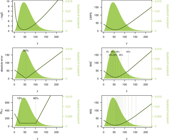
Illustration of different scoring rules.
Logarithmic score, absolute error, interval score (with α = 0.2), CRPS, and 2 versions of the weighted interval score. These are denoted by WIS* (with K =3, α1 = 0.1, α2 = 0.4, α3 = 0.7) and WIS (K = 11, α1 = 0.02, α2 = 0.05, α3 = 0.1,…,α11 = 0.9). Scores are shown as a function of the observed value y. The predictive distribution F is negative binomial with expectation 60 and size 4. Note that the top left panel shows the negative logS, i.e., −logS, which, like the other scores, is negatively oriented (smaller values are better).
3.2. Differing behaviour if agreement between predictions and observations is poor
Qualitative differences between the logarithmic and interval-based scores occur predominantly if observations fall into the tails of predictive distributions.
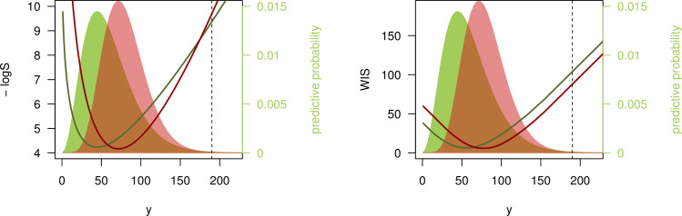
We illustrate this with a second example. Consider 2 negative binomial forecasts: F with expectation 60 and size 4 (standard deviation ≈31) as before, and G with expectation 80, and size 10 (standard deviation ≈26.8). G thus has higher expectation than F and is sharper. If we now observe y = 190, i.e., a count considerably higher than suggested by either F or G, the 2 scores yield different results, as illustrated in Fig 3.
The logS favors F over G, as the former is more dispersed and has slightly heavier tails. Therefore y = 190 is considered somewhat more “plausible” under F than under G (logS(F, 190) = −9.37, logS(G, 190) = −9.69);
The WIS (with K = 11 as in the previous section), on the other hand, favors G as its quantiles are generally closer to the observed value y (WIS(F, 190) = 103.9, WIS(G, 190) = 87.8).
Disagreement between logarithmic score and WIS.
Negative logarithmic score and weighted interval score (with α1 = 0.02, α2 = 0.05, α3 = 0.1,…,α11 = 0.9) as a function of the observed value y. The predictive distributions F (green) and G (red) are negative binomials with expectations μF = 60, μG = 80 and sizes ψF = 4, ψG = 10. The black dashed line shows y = 190 as discussed in the text.
This behavior of the WIS is referred to as sensitivity to distance [3]. In contrast, the logS is a local score which ignores distance. Winkler [27] argues that local scoring rules can be more suitable for inferential problems, while sensitivity to distance is reasonable in many decision-making settings. In the public health context, say a prediction of hospital bed need on a certain day in the future, it could be argued that for y = 190, the forecast G was indeed more useful than F. While a pessimistic scenario under G (defined as the 95% quantile of the predictive distribution) implies 128 beds needed and thus fell considerably short of y = 190, it still suggested more adequate need for preparation than F, which has a 95% quantile of 118.
We argue that poor agreement between forecasts and observations is more likely to occur for COVID-19 deaths than, e.g., for seasonal ILI (influenza-like illness) intensity, which due to larger amounts of historical data is more predictable. Sensitivity to distance then leads to more robust scoring with respect to decision-making, without the need to truncate at an arbitrary value (as required for the log score). While these are pragmatic statistical considerations, it could be argued that the choice of scoring rule should depend on the cost of different types of errors. If the cost of single misguided forecasts is very high, a conservative evaluation approach using the logarithmic score may be more appropriate. This question is obviously linked to the preferences and priorities of forecasts recipients, in our case public health officials and the general public. Studying these preferences in more detail is an interesting avenue for further research.
4. Application to FluSight forecasts
In this section, some additional practical aspects are discussed using historical forecasts from the 2016/2017 edition of the FluSight Challenge. Note that these were originally reported in a binned format, but for illustration, we translated them to a quantile format for some of the below examples.
4.1. An easily interpretable graphic display of the WIS
The decomposition of the WIS into the average width of PIs and average penalty for observations outside the various PIs (see section 2.1) enables an intuitive graphical display to compare different forecasts and understand why one forecast outperforms another. Distinguishing also between penalties for over- and underprediction can be informative about systematic biases or asymmetries. Note that decompositions of quantile or interval scores for visualization purposes have been suggested before (see, e.g., [28]).
Fig 4 shows a comparison of the IS0.2 and WIS (with K = 11 as before) obtained for 1-week-ahead forecasts by the KCDE and SARIMA models during the 2016/2017 FluSight Challenge, [9,29], using data obtained from [30]. It can be seen that, while KCDE and SARIMA issued forecasts of similar sharpness (average widths of PIs, blue bars), SARIMA is more strongly penalized for PIs not covering the observations (orange and red bars). Broken down to a single number, the bottom right panel shows that predictions from KCDE and SARIMA were on average off by 0.25 and 0.35 percentage points, respectively (after taking into account the uncertainty implied by their predictions). Both methods are somewhat conservative, with 80% PIs covering 88% (SARIMA) and 100% of the observations (KCDE). When comparing the plots for IS0.2 and WIS, it can be seen that the former strongly punishes larger discrepancies between forecasts and observations while ignoring smaller differences. The latter translates discrepancies to penalties in a smoother fashion, as could already be seen in Fig 2.
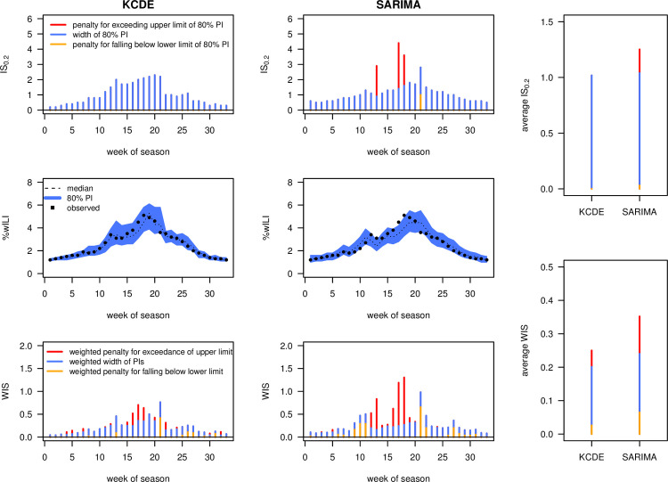
Interval and weighted interval score applied to FluSight forecasts.
Comparison of 1-week-ahead forecasts by KCDE and SARIMA over the course of the 2016/2017 FluSight season. The top row shows the interval score with α = 0.2, the bottom row the weighted interval score with α1 = 0.02, α2 = 0.05, α3 = 0.1,…, α11 = 0.9. The panels at the right show mean scores over the course of the season. All bars are decomposed into the contribution of interval widths (i.e., a measure of sharpness; blue) and penalties for over- and underprediction (orange and red, respectively). Note that the absolute values of the 2 scores are not directly comparable as the WIS involves rescaling of the included interval scores.
4.2. Visually assessing calibration
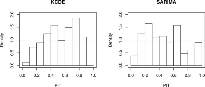
While the middle row of Fig 4 provides a good intuition of the sharpness of different forecasts, different visual tools exist to assess their calibration. A commonly used approach is via probability integral transform (PIT) histograms ([13,31]; see also [15]) for adaptations to count data. These show the empirical distribution of
PIT histograms.
PIT histograms for 1-week-ahead forecasts from the KCDE and SARIMA models, 2016–2017 FluSight season. Note that to account for the discreteness of the binned distribution, we employed the nonrandomized correction suggested in [13].
The exact PIT values cannot be computed if forecasts are reported in a quantile format, but if sufficiently many quantiles are available one can evaluate in which decile or ventile they fall. This is sufficient to represent them graphically in a histogram with the respective number of bins. A technical problem arises if an observation is exactly equal to one or several of the reported quantiles (which can happen especially in low count settings). The corrections for discreteness suggested by [13] cannot be applied in this case and there does not seem to be a standard approach for this. A practical strategy is to split up such a count between the neighboring bins of the histogram (assigning 1/2 to each bin if the realized value coincides with one reported quantile, 1/4, 1/2, 1/4 if it coincides with two, 1/6, 1/3, 1/3, 1/6 if it coincides with three, and so on).
4.3. Empirical agreement between different scores
To explore the agreement between different scores, we applied several of them to 1- through 4-week-ahead forecasts from the 2016/2017 edition of the FluSight Challenge. We compare the negative logarithmic score, the negative multibin logarithmic score with a tolerance of 0.5 percentage points (both with truncation at −10), the CRPS, the absolute error of the median, the interval score with α = 0.2, and the weighted interval score (with K = 11 and α1 = 0.02, α2 = 0.05, α3 = 0.1,…, α11 = 0.9 as in the previous sections). To evaluate the CRPS and interval scores, we simply identified each bin with its central value to which a point mass was assigned. Fig 6 shows scatterplots of mean scores achieved by 26 models (averaged over weeks, forecast horizons, and geographical levels; the naïve uniform model was removed as it performs clearly worst under almost all metrics).
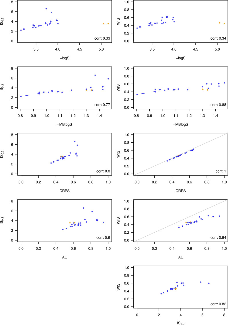
Comparison of 26 models participating in the 2016/2017 FluSight Challenge under different scoring rules.
Shown are mean scores averaged over 1- through 4-week-ahead forecasts, different geographical levels, weeks, and forecast horizons. Compared scores: negative logarithmic score and multibin logarithmic score, continuous ranked probability score, interval score (α = 0.2), weighted interval score with K = 11. Plots comparing the WIS to CRPS and AE, respectively, also show the diagonal in gray as these 3 scores operate on the same scale. All shown scores are negatively oriented. The models FluOutlook_Mech and FluOutlook_MechAug are highlighted in orange as they rank very differently under different scores.
As expected, the 3 interval-based scores correlate more strongly with the CRPS and the absolute error than with the logarithmic score. Agreement between the WIS and CRPS is almost perfect, meaning that in this example, the approximation (3) works quite well based on the 23 available quantiles. Agreement between the interval-based score and the logS is mediocre, in part because the models FluOutlook-Mech and FluOutlook-MechAug receive comparatively good interval-based scores (as well as CRPS, absolute errors and even MBlogS), but exceptionally poor logS. The reason is that while having a rather accurate central tendency, they are too sharp with tails that are too light. This is sanctioned severely by the logarithmic score, but much less so by the other scores (this is related to the discussion in section 3.2). The WIS score (and thus also the CRPS) shows remarkably good agreement with the MBlogS, indicating that distance-sensitive scores may be able to formalize the idea of a score which is slightly more "generous" than the logS while maintaining propriety. Interestingly, all scores agree that the 3 best models are LANL-DBMplus, Protea-Cheetah, and Protea Springbok.
5. A brief remark on evaluating point forecasts
While the main focus of this note is on the evaluation of forecast intervals, we also briefly address how point forecasts submitted to the COVID-19 Forecast Hub will be evaluated. As in the FluSight Challenge [7], the absolute error (AE) will be applied. This implies that teams should report the predictive median as a point forecast [32]. Using the absolute error in combination with WIS is appealing as both can be reported on the same scale (that of the observations). Indeed, as mentioned before, the absolute error is the same as the WIS (and CPRS) of a distribution putting all probability mass on the point forecast.
The absolute error, when averaged across time and space, is dominated by forecasts from larger states and weeks with high activity (this also holds true for the CRPS and WIS). One may thus be tempted to use a relative measure of error instead, such as the mean absolute percentage error (MAPE). We argue, however, that emphasizing forecasts of targets with higher expected values is meaningful. For instance, there should be a larger penalty for forecasting 200 deaths if 400 are eventually observed than for forecasting 2 deaths if 4 are observed. Relative measures like the MAPE would treat both the same. Moreover, the MAPE does not encourage reporting predictive medians nor means, but rather obscure and difficult to interpret types of point forecasts [14,32]. It should therefore be used with caution.
6. Discussion
In this paper we have provided a practical and hopefully intuitive introduction on the evaluation of epidemic forecasts provided in an interval or quantile format. It is worth emphasizing that the concepts underlying the suggested procedure are by no means new or experimental. Indeed, they can be traced back to [33,34]. As mentioned before, a special case of the WIS was used in the 2014 Global Energy Forecasting Competition [21]. A scaled version of the interval score was used in the 2018 M4 forecasting competition [35]. The ongoing M5 competition uses the so-called weighted scaled pinball loss (WSPL), which can be seen as a scaled version of the WIS based on the predictive median and 50%, 67%, 95%, and 99% PIs [36].
Note that we restrict attention to the case of central prediction intervals, so that each prediction interval is clearly associated with 2 quantiles. The evaluation of prediction intervals which are not restricted to be central is conceptually challenging [37,38], and we refrain from adding this complexity.
The method advocated in this note corresponds to an approximate CRPS computed from prediction intervals at various levels. A natural question is whether such an approximation would also be feasible for the logarithmic score, leading to an evaluation metric closer to that from the FluSight Challenge. We see 2 principal difficulties with such an approach. Firstly, some sort of interpolation method would be needed to obtain an approximate density or probability mass function within the provided intervals. While the best way to do this is not obvious, a pragmatic solution could likely be found. A second problem, however, would remain: For observations outside of the prediction interval with the highest nominal coverage (98% for the COVID-19 Forecast Hub), there is no easily justifiable way of approximating the logarithmic score, as the analyst necessarily has to make strong assumptions on the tail behavior of the forecast. As such poor forecasts typically have a strong impact on the average log score, they cannot be neglected. And given that forecasts are often evaluated for many locations (e.g., over 50 US states and territories), even for a perfectly calibrated model, there will on average be one such observation falling in the far tail of a predictive distribution every week. One could think about including even more extreme quantiles to remedy this, but forecasters may not be comfortable issuing these and the conceptual problem would remain. This is linked to the general problem of low robustness of the logarithmic score. We therefore argue that especially in contexts with low predictability such as the current COVID-19 pandemic, distance-sensitive scores like the CRPS or WIS are an attractive option.
Acknowledgements
We thank Ryan Tibshirani and Sebastian Funk for their insightful comments.
The content is solely the responsibility of the authors and does not necessarily represent the official views of the CDC.
References
1
2
3
4
5
6
7
8
9
10
11
12
13
14
15
16
17
18
19
20
21
22
23
24
25
26
27
28
29
30
31
32
33
34
35
36
37
38